Explorable Design Patterns
status: draft, living doc, invitation to collaborate
As we embark on creating visualizations of algorithms I thought it would be constructive to talk a bit about what makes a visualization a good visualization. That is, to rationalize it beyond “it looks nice”.
Before we start finding patterns, let’s start with examples of a really good visualization: Amit’s A* pathfinding visualization, the oracle, explorables and neural networks.
What is it that makes us get that warm fuzzy feeling that we get when we interact with this work? Why was this better than reading the book alone? Why was this better than watching the class/youtube alone?
Design Patterns
You should read it straight from the source (interactive illustrations, explorable explanations, scientific communication as sequential art, simulation as a practical tool, leaning programming), but I’ll try to re-interpret it more concisely using my own words: interactive explanations are good when they fundamentally capture the essence of the computer as a new media.
Books as a media are fundamentally static: what’s written is written and it won’t change until the next edition. TV as a media is dynamic (e.g. the content changes) but not interactive (i.e. it doesn’t change in response to your acting, e.g. you can’t click / tap on TV).
Computers, on the other hand, are fundamentally interactive: they can respond to user’s input (computers are connected too, e.g. you can connect students through comments, but that’s beyond the point I’m trying to make in this section).
For example, if an illustration is completely static, it competes with books. If it is just a frame-by-frame play, they compete with Youtube.
But if they are interactive, ah, now they are on their own league: they will offer something genuinely original.
So, if an active reader is the key, and interactivity is the tool, what kinds of interactivity are most effective?
Like much of what’s exciting in life, this is unexplored territory. You should read what has worked and not worked in the past (lots of diaries of trial and error), but take it more as a guide than a norm.
Having said that, here are some patterns that I have observed work well (and digested from these learnings, and here too).
They complement
First and foremost, good interactive explanations play a role complementary to other media: books, classes and videos. They know their strengths and their weaknesses and complement the student toolbox. If you only have static text you are better off with a book. If you your interactions don’t respond to user input, you are better off watching a video.
They form a cohesive narrative
http://simblob.blogspot.com/2016/12/five-year-mission.html
http://blog.ncase.me/explorable-explanations/
This is most probably the most overlooked design pattern. Start here, and the rest will flow into place.
Good interactive explanations have a deliberate progression and rhythm.
Like a good Bond movie, they do an amazing job on the first act, capturing the reader’s attention with a splash result, a challenge or an invitation to a journey (example). There is a limit to how much time one devotes, so it has to be short and impactful.
Start with a hook: describe the problem, not the solution. For example, in the first section of the A* algorithm, Amit talks about pathfinding, NOT A*. Pathfinding is something a lot more relatable, something that anybody can understand from no prior knowledge and something that will create a spark of curiosity (“how the hell is this done?”).
Chances are you are going to lose a lot of readers in the first 5 paragraphs if you don’t do a good job catching their attention in the introduction. You want to do a really really really good job here, so, take a deep breath and thing very hard about your first few sentences. A few points:
- Don’t talk about the solution, talk about the problem you are trying to solve
- Create a really really really good visualization here of the problem you are trying to solve (see amit’s introduction on how the goes about pathfinding without ever talking about A*)
- Stick with the problem you’ve picked throughout your entire narrative. There is a major cost in context switching.
- Give an introduction of why other approaches don’t work well and
- Create a curiosity on the user of your specific solution, but don’t quite yet uncover it until the next section.
Build up from basics. They follow with an incremental progression of complexity, building an intuition from one step to the other. Like a soap opera, each step ends with a hint of what’s next creating a level of anticipation (e.g. see how this is slow? We can make it faster by doing X). Like a soap opera too, they allow readers to reach their own conclusions rather than giving them for free. They introduce each new concept very deliberately and meticulously.
Between acts, they go back and forth, moving up and down the abstraction ladder.
At the closing act, they wrap things up and draw conclusions (e.g. comparisons).
They show the data applied to a real example
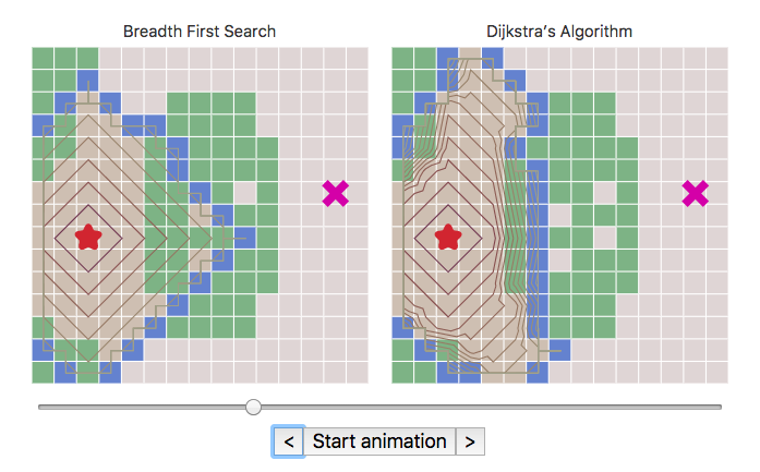
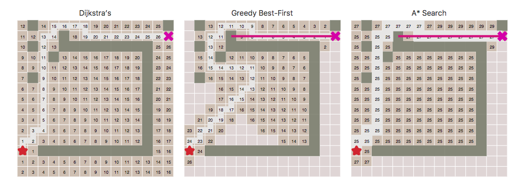
As opposed to abstractly in a data structure (e.g. a tree, an array, etc). For example, here, all of the visualizations/diagrams are shown in the context of the problem space, NOT abstractly in a data structure. They certainly go over how to map the real world problem in a data structure (and the trade-offs between the way you pick data structures to represent the problem) BUT all o the visualization go back to how to address the algorithm in the context of the problem.
They respond immediately
Computers are interactive, but they are also pretty fast.
If the key for interactive explanations is to respond, responding immediately creates a new set of opportunities.
It shortens the feedback loop and encourages serendipitous exploration: if the cost of trying something new is super low, a significant amount of examples/use cases/configurations can be tried compared to a book or a video or talking to a person.
Inspired by Larry Tesler’s work, good interactive explanations don’t have modes: there isn’t a “edit mode” and a “running mode”, but a morphing structure that is both running and changing at the same time.
For example, the interactive explanation immediately responds to move mousements and runs the algorithm with a different configuration.
They abstract time
http://worrydream.com/LadderOfAbstraction/
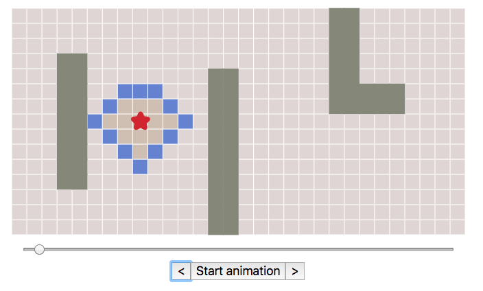
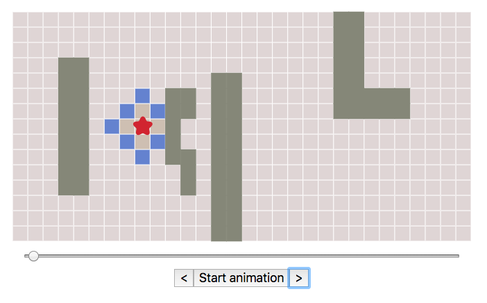
They enable readers to interact with the algorithm in their own time (as opposed to real time).
For example, they give active readers a slider that enables them to go back and forth in the algorithm and explore how they behave through time.
They abstract data
http://worrydream.com/LadderOfAbstraction/
They enable readers to control the data (e.g. input parameters) and show immediately how the algorithm behaves.
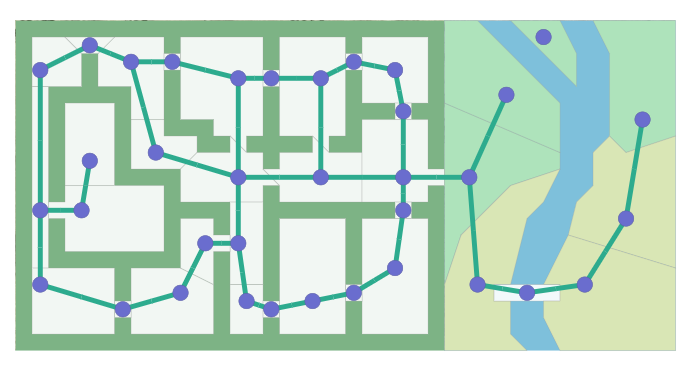
For example, they enable an active reader to change the input/data the algorithm operates on: new configurations for a chess board, add/remove walls / rivers on a map, add/remove (x, y) points in a linear regression algorithm, the curvature of roads in a self-driving car algorithm, etc.
Importantly, the interactive explanation reacts immediately to the change of the data: the active reader gets a immediate feedback of what changing the initial circumstances do (e.g. does the algorithm fail in a corner case? does it behave surprisingly in a different configuration?).
They abstract algorithm
http://worrydream.com/LadderOfAbstraction/
They enable readers to control the parameters of the algorithm (e.g. what speed should the robot go) and to visualize immediately what are the consequences (e.g. does the robot move to the left now because of that change?).
They abstract space
http://worrydream.com/LadderOfAbstraction/
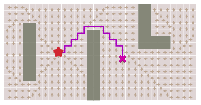
They enable readers to see both where the algorithm has been as well as where it is going in this point in time.
That is, given this fixed point in time, where has the algorithm been and where is it going through space? For example, in these visualizations the “spatial” control known tells you where the algorithm has been as well as where it is going to be spatially, and controlling the algorithm will give you immediate response of how it behaves.
Here is another example: as you change configurations, you can see where the algorithm was and will be in the future.
They compare and contrast
http://worrydream.com/LadderOfAbstraction/
They abstract the problem away and in its final morphed state they almost have no resemblance of the original problem. They move on from visually making a connection with the original problem and they start talking in a higher order wavelength. For example, here is a comparison of three dimensions: the algorithm (the turning rate), the data (the bend angle) e the performance (red is good white is bad). They force active readers to interpret this higher order graph and to ask themselves why this happens.

They enable the unanticipated
Much like a game design, the exploratory nature of good interactive explanations enables the active reader to learn something that the explanation designer never anticipated. Maybe it is a new way to look at the data, maybe it is a new insight that is only perceived by a few students, maybe it is a new configuration of the data that breaks the assumptions of the author of the explanation.
Serendipity by design.
Unexplored Patterns
I think there are a few unexplored patterns that I think could be worth exploring to aid the comprehension of the algorithms that are fundamentally connected to the nature of computers.
Maybe they should be connected?
Computers are interactive, yes, but they are also connected to each other.
How can we take advantage of the fact that computers are interconnected?
Would something like a commenting system help students answer each other’s question? Here is an example from Amit’s blog. The commenting system seems to provide a series of value added compare to both books and videos:
- First and foremost, they give you direct access to the author, creating a much more accessible connection and a shorter feedback loop: active readers get to known the author and authors get to know how active readers learn (and iterate).
- Secondly, but possibly as important, they enable student
- -to-student collaboration: a huge library where asking questions is super low bar.
Is there some sort of gamification that can be applied (e.g. top 10 students that were able to devise the best algorithm configurations for a problem? Write your own algorithm?)?
Maybe they should use Q&A to cement comprehension?
Question / Answering: as part of the interactivity, can we do more to engage with the reader and ask them questions (e.g. to validate their comprehension?)? Lots of precedence in corporate training material, so wondering if that could be an effective design pattern.